Industry 4.0
Supervisor


Supervisor is a web application designed for Industry 4.0. Its purpose is to monitor and manage the MES (Operator Panel) from the perspective of factory managers, providing them with real-time insights into production processes.

-min.jpg)
The main goal of the app for factory managers is likely to centralize monitoring and management of factory operations to enhance efficiency, decision-making, and communication.
The project lacked a well-defined product vision, leading to frequent changes in requirements and a lack of strategic direction. This resulted in increased development time, decreased team morale, and a potential for a suboptimal user experience.
There was insufficient user testing and feedback incorporated into the development process.Also the project did not prioritize user needs and preferences, leading to a product that was not aligned with user expectations.
Frequent and significant changes to the product requirements disrupted the development process and impacted the team's ability to deliver on time.
The development team focused too much on technical details, which caused them to overlook user experience and product quality. The result was a product that worked well technically but wasn’t user-friendly and satisfying.
"After realizing the current problem and setting a clear goal, I decided to start with research. You can explore all stages of my design process, from empathize to test, or skip ahead to see the final designs and results."
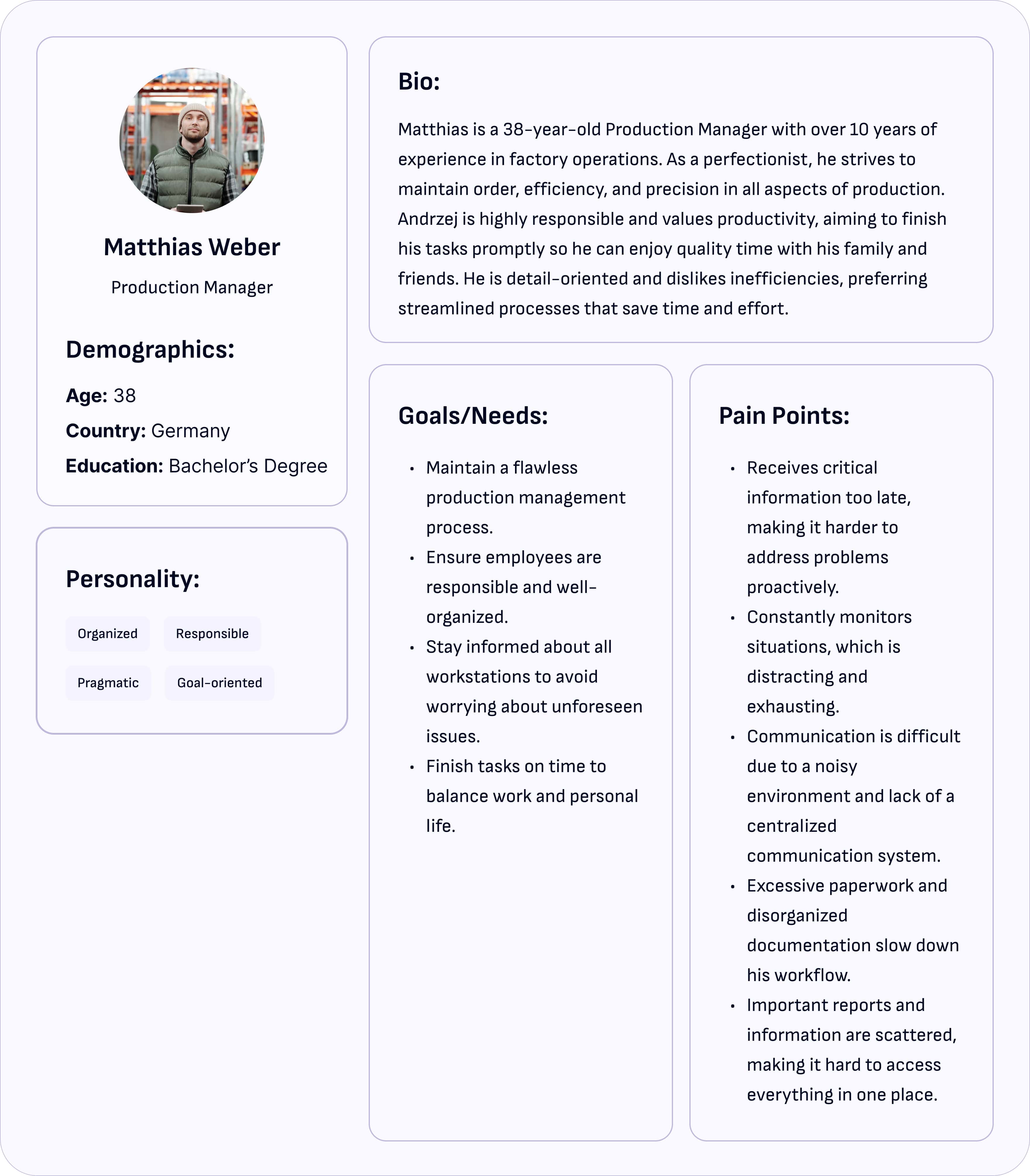
The first step is to fully grasp the user context. This involves: analyzing technical requirements to understand the product's core functionality. I then conduct industry analysis to identify best practices, competitors, and gaps that the product can fill. To gain a deeper understanding of user needs, I perform user interviews, surveys, and field studies, observing real-world user behavior. Additionally, I develop personas to represent key user types, ensuring we keep the user at the center of the design process.
“Zofie’s meticulous approach to quality control and Matthias’s need for operational clarity were eye-opening. Their struggles motivated me to dig deeper.”
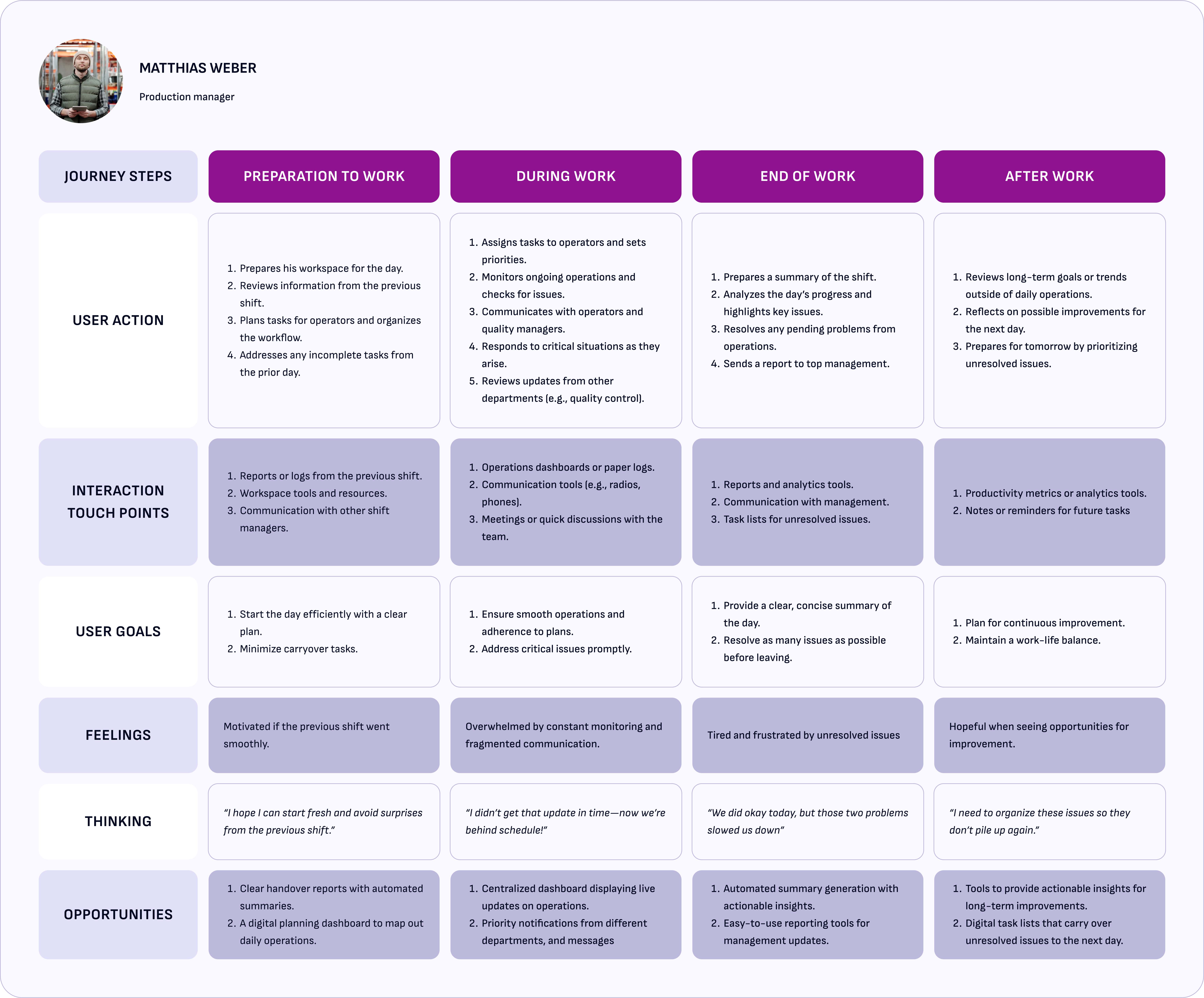


“Talking to Zofie and Andrzej showed me their biggest struggles—like juggling scattered reports or missing important updates. Mapping their journeys helped me understand these pain points and design something that truly makes their work easier.”
Managers like Zofie and Matthias struggle with fragmented information and unclear communication tools, as highlighted in your CJM.
When I spoke with Zofie and Andrzej, it became clear they lacked tools like real-time dashboards, instant notifications, and detailed reports. Tracking production and performance manually caused errors and wasted time. That’s why I implemented these features—to make their tasks easier, faster, and more intuitive
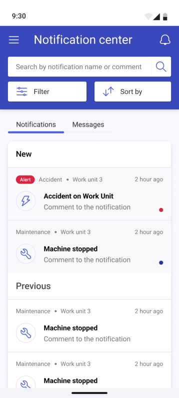
Notifications: Critical for keeping production managers informed in real time about equipment status, machine downtime, and other key operational issues.
Reports: Providing dynamic and real-time reporting features enabled users to get detailed insights into production performance, quality control, and resource allocation, empowering them to make data-driven decisions.
Dashboard: The introduction of a customizable dashboard allowed production managers to have an overview of key metrics at a glance, helping them monitor ongoing operations efficiently and quickly identify bottlenecks
In the Ideate phase, I focused on brainstorming a wide range of solutions to address the problems I had identified in the Define phase. The goal was to think creatively while still aligning with the real needs of the users — like Zofie and Mattheis — who needed better tools to manage production and stay informed.
"Working with the team, we brainstormed ways to add real-time dashboards, notifications, and detailed reports while keeping everything practical and doable."


This IA was designed to simplify navigation for managers and engineers by grouping related features logically. It ensures users can easily find what they need, like workstation details or production reports.
Building on this structure, I created detailed User Flows to illustrate how users interact with differentfunctionalities.

The user flow for user’s daily tasks emphasized minimizing unnecessary clicks and surfacing key information quickly.
"After finalizing the structure and flows, I moved on to creating wireframes to visualize how the solution would take shape."
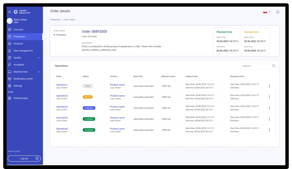
The final design features an intuitive dashboard, real-time notifications, and an integrated communication tool—key features Zofie and Matthias expressed a need for. Additionally, the system includes intuitive, workstation-specific reports, providing tailored insights for different roles. These tools address their frustrations with the previous system, enhancing usability and enabling seamless, informed decision-making in real-time.
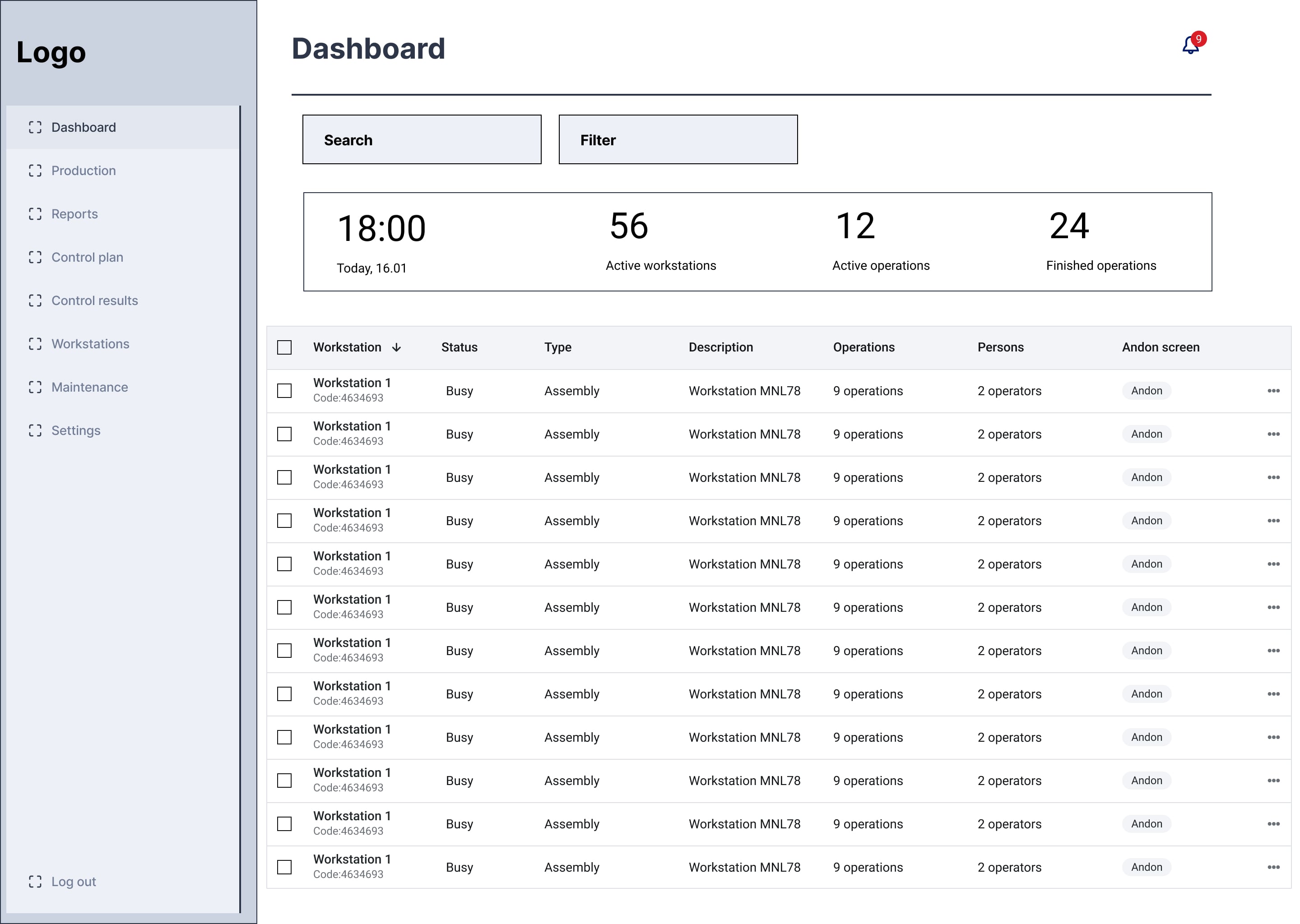
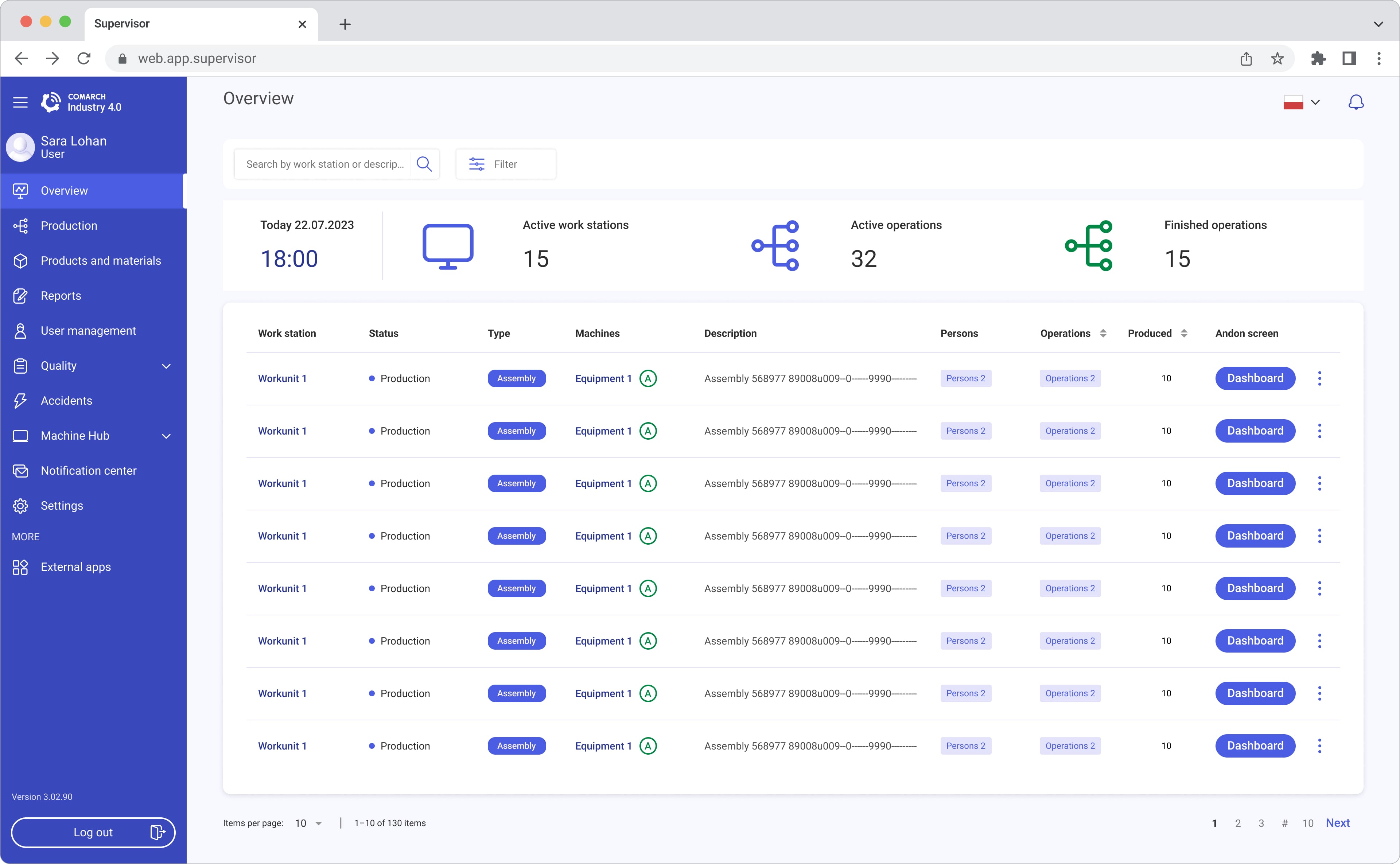
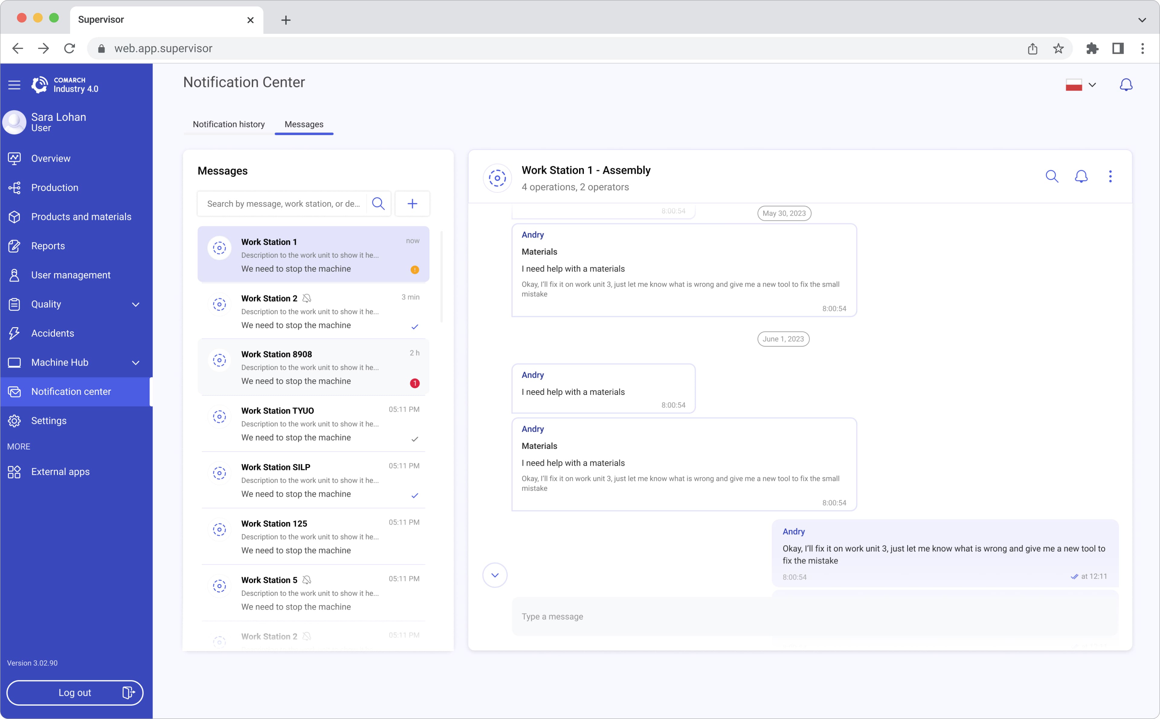
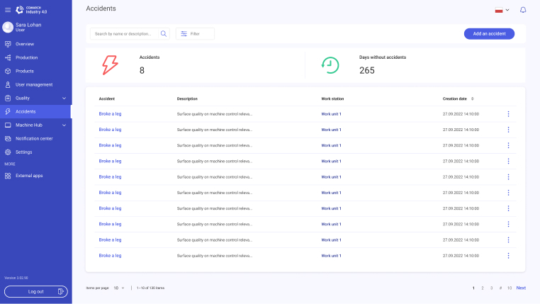
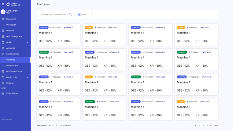
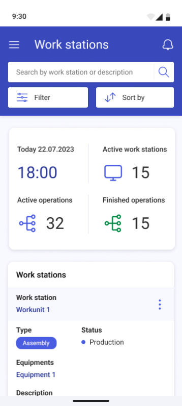
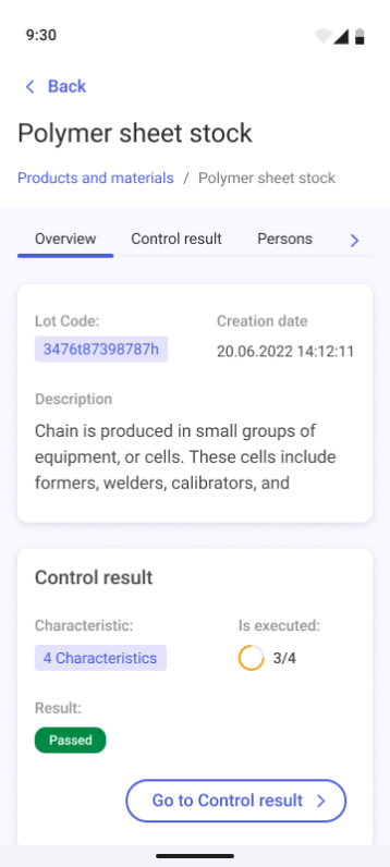
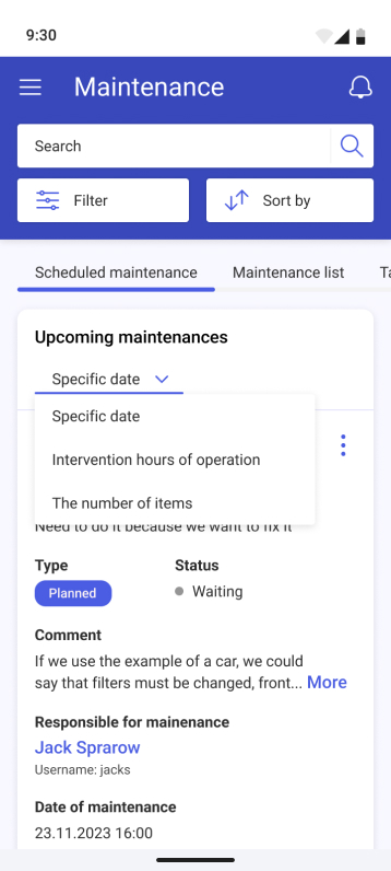
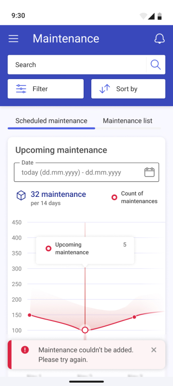
Dashboard: Ensures streamlined operations with real-time updates for faster decision-making. Displays the operation statuses throughout the day, showing the statuses of workstations, the people assigned to each workstation, and the number of products produced at each station
“This feature is critical for users like Matthias and Zofie, offering centralized overviews with actionable insights.”
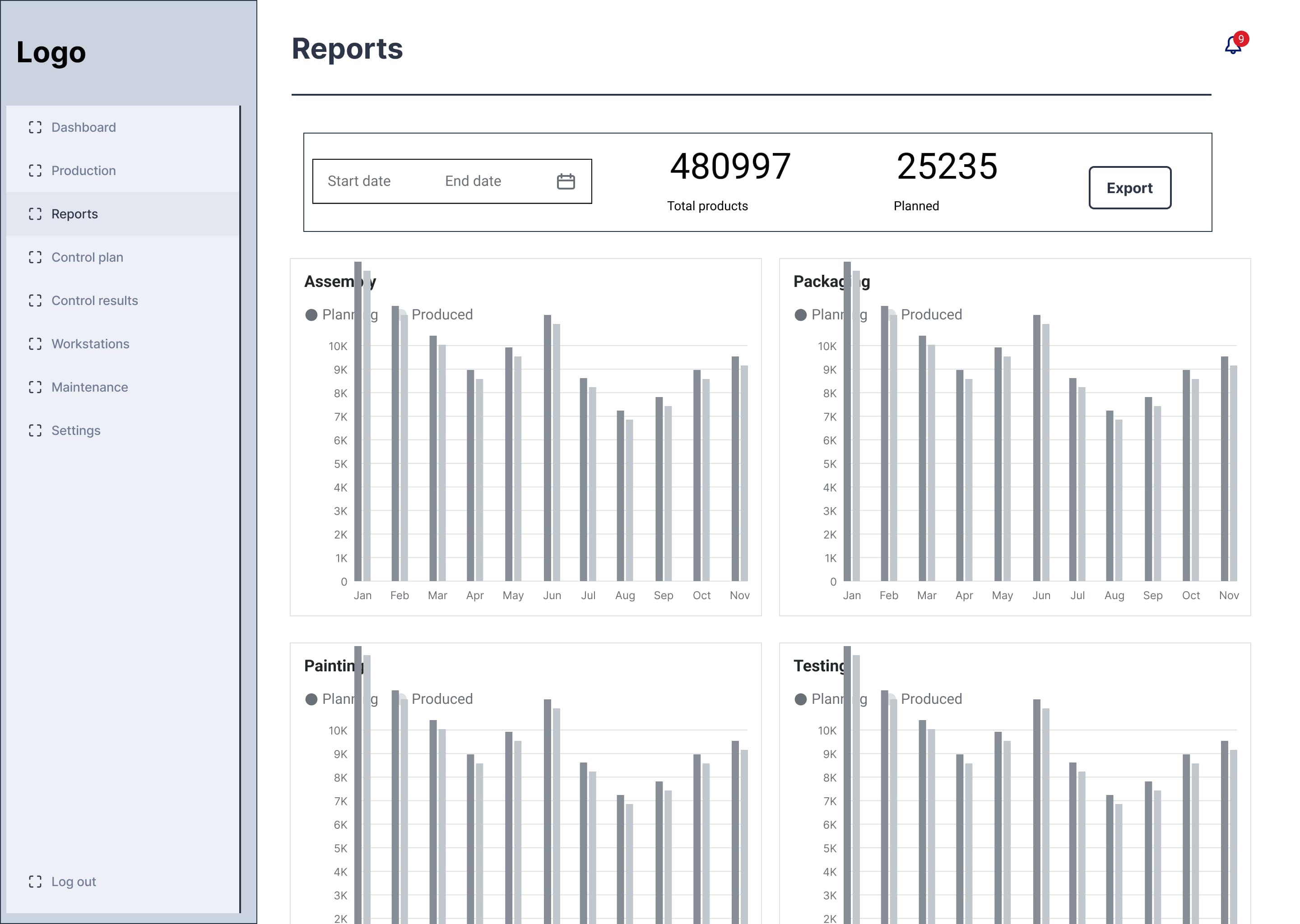
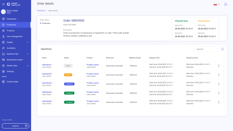
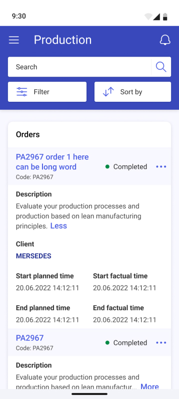
Report: Generates detailed reports for each workstation type (e.g., assembly, packaging) and overall production, including planned production data for comparison.

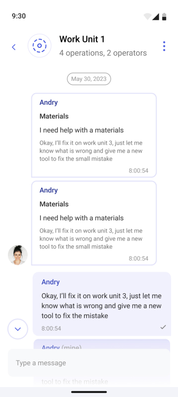
Notifications: Priority-based notification system to ensure critical issues are addressed promptly and not lost in noisy environments.

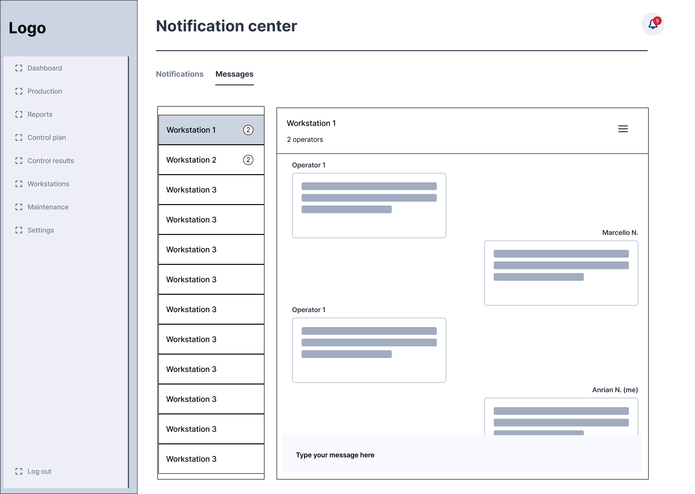
Messages: Provides a centralized communication hub for sharing updates, task assignments, and alerts directly with team members.


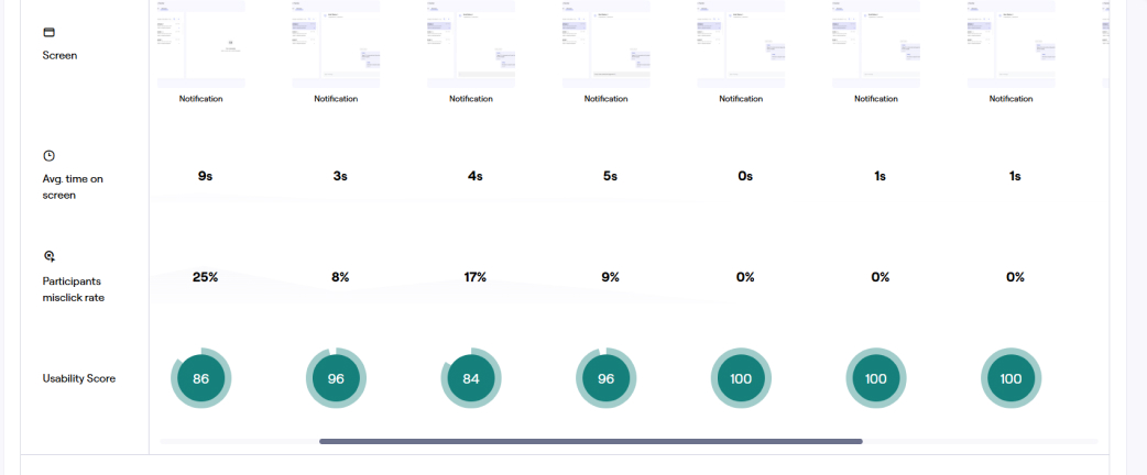
User testing revealed that while the dashboard was intuitive, notifications needed clearer prioritization. Iterative testing ensured we addressed these nuances
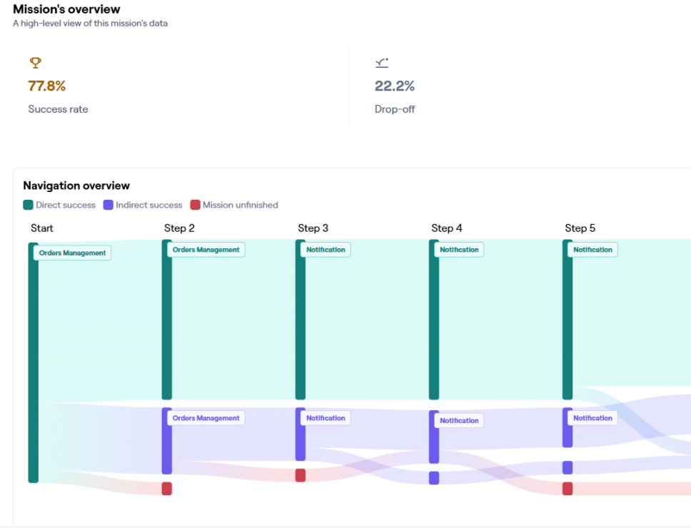
The results of one test revealed that some users dropped off because they couldn’t locate the appropriate button to perform their task. This feedback highlighted issues with button visibility and placement, emphasizing the need for clearer visual cues and improved usability in the design.
After conducting usability testing, I revisited the Ideate phase to review and refine the designs based on user feedback. This prompted a redesign of the interface to improve button visibility and placement.
“Testing again proved the updates worked—users found it easier to navigate, especially notifications. It showed me how much clearer and more user-friendly the design had become."

Notification Center Relocation: Changed the notification center's location from its previous spot to the main menu based on user feedback. This adjustment makes it easier to discover and aligns with user expectations..
Reduced Drop-Off Rates: After implementing these changes, subsequent tests showed significantly improved task completion rates
Enhanced User Satisfaction: Users provided positive feedback, finding the updated interface more intuitive and user-friendly.
The final design made workflows more efficient and helped users make quicker, more informed decisions with interactive dashboards and key features like reports and notifications. Users loved the clear layout and ease of use, while stakeholders appreciated how well the app addressed industry challenges. This project showed me the value of aligning user needs with business goals to create a truly impactful solution.
“This project taught me the importance of balancing user needs with business goals. It was rewarding to see how my designs could reduce stress for managers like Zofie and Matthias."
Enhanced User Satisfaction: User research and usability testing allowed us to identify and address pain points, resulting in a more intuitive and enjoyable user experience.
Increased Efficiency: Streamlined workflows and clear navigation reduced the time users spent on tasks, improving productivity.
Reduced Error Rates: A well-designed interface with clear instructions and error prevention mechanisms minimized user errors.
